
Sameer Mhaisekar
SquaredUp, Technical Evangelist
Among all the cool features of SquaredUp Community Edition, the coolest kid on the block is probably the PowerShell tile. The reason is simple – PowerShell is easy, it’s awesome, and it’s powerful!
Not only can you retrieve data from the source (like the APIs), but you can also manipulate that data, work with variables, loop it, filter it, and use it in whichever way works the best. Like they say, the things PowerShell can do are only restricted by the proficiency of the user.
Not a lot of dashboarding tools out there give you this power to visualize PowerShell scripts. And it’s not usually free too! That’s why I was excited to see this PowerShell tile in Community Edition. Let’s dive in!
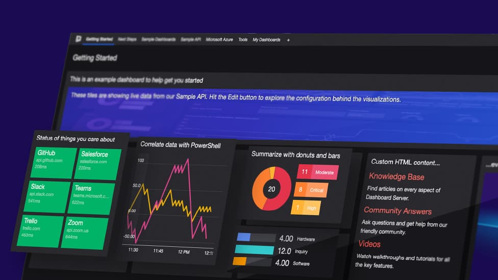
Since this is a brand-new tile, this is the first time I’m using this as well. Let’s check out what the wizards are and some of the sample dashboards in here to see how exactly this works.
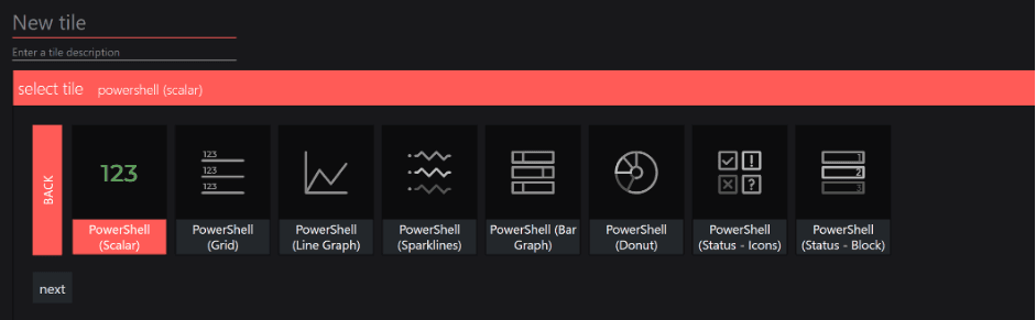
Some nice visualization formats! I like that.
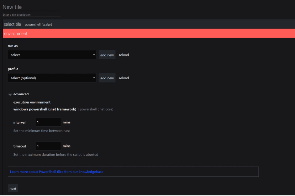
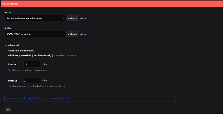
Next up, you have an “environment” section. Here you can choose the right account that has appropriate permissions (ideally least required privileges) to run the script.
You also have a profile section where you can enter pre-sets for a script, a common piece of code that has to run for a set of scripts, or set up authentication, etc. Whatever you enter here will be encoded and will only be accessible to SquaredUp admins.
And lastly and rather helpfully, you have advanced settings where you can choose the timeout period for the script as well as how frequently you want to run it (instead of the default 60 sec).
For example, if I set the interval value to 60 min, the script will run once at that point and will cache it’s result for the next 60 min. What that does is it reduces significantly the amount of resources each script is using and dashboards load much quickly.
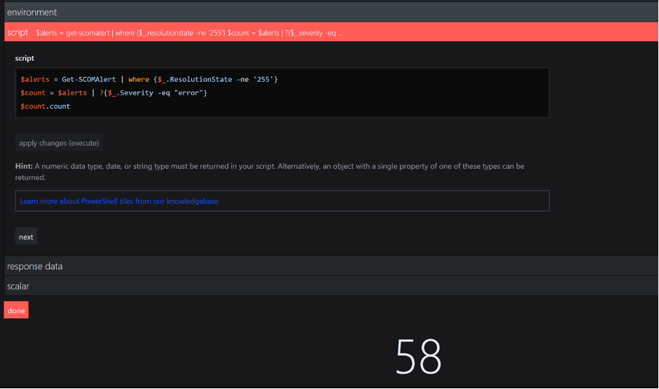
And then you have the space to enter the actual script:
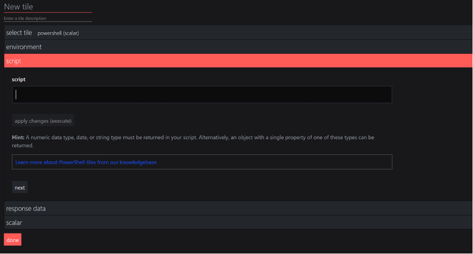
You’ll also notice the “response data” section underneath, which basically returns the output of the scripts and helps you identify whether the output fits the format required for the tile chosen.
Alright – seems easy enough. Let’s check some examples quickly.
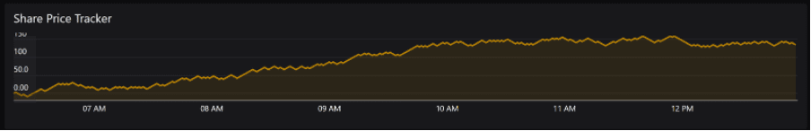
Here's the Share Price Tracker line graph dashboard under Sales & Business dashboard.
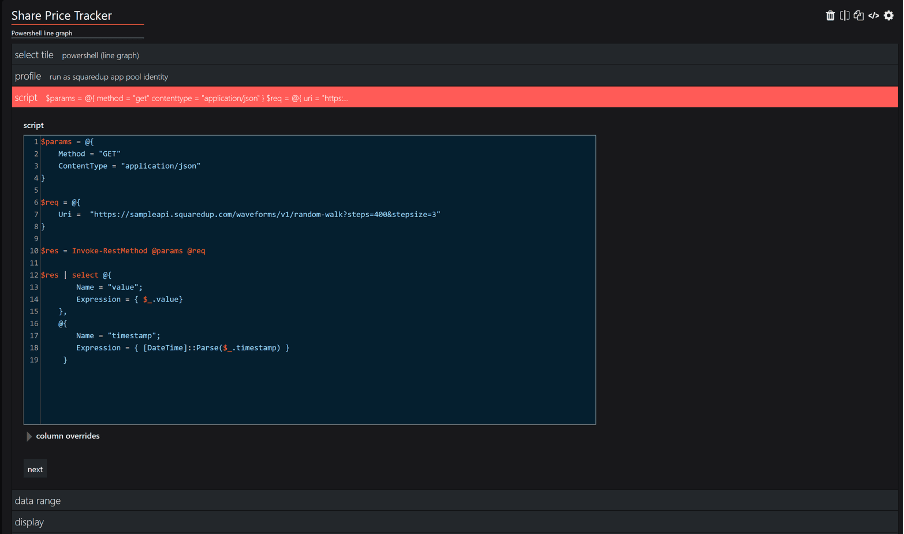
Looks like the tile is using the default “squaredup app pool identity” profile and the script itself is actually calling an API that we use internally and outputting it as a series of values with timestamps on them. If I run this script outside of Community Edition, this is the response I see:
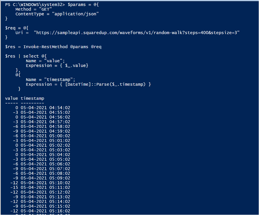
This response is ideal for a line graph! This is what I was referring to when I said you can manipulate the data you get instead of relying on the source to provide you the data in the format you want.
Alright, I think I’ve got the hang of this now. Let’s try to create our own little dashboard!
I’ll start with a simple one. I have a SCOM environment, and I want to see how many active critical alerts I have in there currently. A very simple, couple of lines of code.
I’ve chosen the scalar tile. In the environment section I’m specifying my run as account that has the right permissions and in the profile “SCOM MG Connection”, I’m simply connecting to my SCOM environment so I don’t expose my server details to non admins.
…and BAM, there you go!
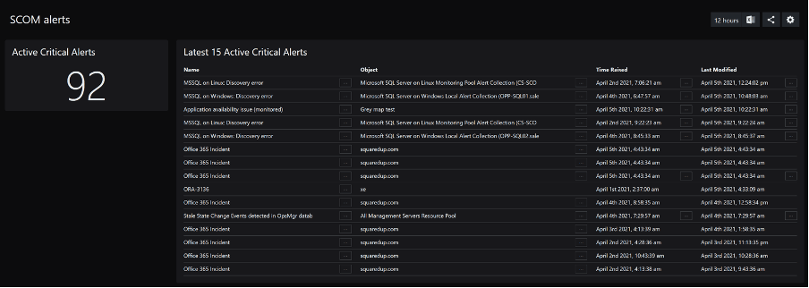
Now, let’s leverage the same concept and list the first 15 of those alerts using a Grid tile.
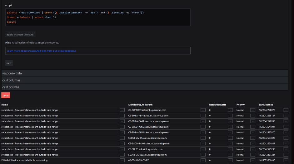
You’ll also notice that you can choose to hide or show the columns in the output. And just like that, we have a list of alerts currently active in SCOM.
With that, let’s end this here. As you can imagine we’ve just scratched the surface of what is possible with the PowerShell tile. In the subsequent blogs to follow, we will cover some more detailed use cases and more complex PowerShell scripts, so hang tight!
Until then, happy dashboarding!