Sameer Mhaisekar
SquaredUp, Technical Evangelist

SquaredUp recently launched a PowerShell tile that lets you visualize data returned from a PowerShell script. This has opened virtually infinite doors to the sources you can get data from.
PowerShell can work with crazy text formats obscure databases, and endpoints that are open on the internet. If you can access it, PowerShell can work with it. And SquaredUp lets you leverage that power so you can get the information you need and visualize it in a format that makes sense.
Since the PowerShell tile release, I’ve been playing with the tile quite a lot and I’m in love with the power it puts in your hands to visualize almost anything you want. The documentation is great and I’ve come across a few additional tips and tricks you might need when working with some of the visualizations. I thought I’d share them here.
The scalar and the grid tiles are pretty straightforward. Scalar needs a number and Grid needs a tabular output at the end of the scripts. For example, a grid output would look like this:


You could create a scalar visualization using PowerShell like in this Microsoft Teams dashboard where they visualized the number of teams being monitored, which are owned, and which are empty. The same dashboard also makes heavy use of PowerShell grid tiles to list out the teams and sections within Microsoft Teams.
The line graph and the sparkline both work similarly in that both of them require two datasets, a timestamp, and a numeric property associated with each timestamp. If you have a third dataset as a string data type corresponding to each set of timestamp and the value, you can use it to label the respective graph.
For example, I have a PowerShell script that returns data in the following format:

Note that there are three datasets, a value column (numeric), a label column (string), and a distinct timestamp (DateTime). These work together to plot a graph that looks like the following:

One thing to note here is that you have to make sure that the timestamp you’re outputting is one of the ones SquaredUp supports.
You can see the use of timeseries line graphs using PowerShell in the VMware status dashboard in our Dashboard Gallery. One line graph shows the average CPU and memory statistics over 24 hours for a host, for example.
Donut and Bar tiles require a collection of objects with a numeric value associated with each collection (typically the count of objects in that collection).
So to make it work with a donut or bar tiles, you have to have your script return data in the following format.

The result looks something like this:

You can see this example as part of the full VMware dashboard. The PowerShell bar graph is used to summarize how many servers have a specific amount of memory so they can manage limited resources.
In additon, the au2mator dashboard has a great example of why you might use a PowerShell Donut visualization. Au2mator used a PowerShell Donut tile to visualize users because their database stored the SamAccountName but, with PowerShell, they could access and use the DisplayName from Active Directory.
Then you’ve got the status icons and blocks you can cerate with PowerShell scripts. Here, you must output a column named “state” with one of the three values assigned to each record – Healthy, Critical or Warning. You can output another column of string data with each record and SquaredUp will treat it as the name of that entity. For example, the output should look like this:

And the PowerShell status tile will render:

You can see this tile in context in the VMware dashboard example in dashboard gallery. A status tile like this could be used in a customer-facing dashboard to show which VMs are on and which are off.
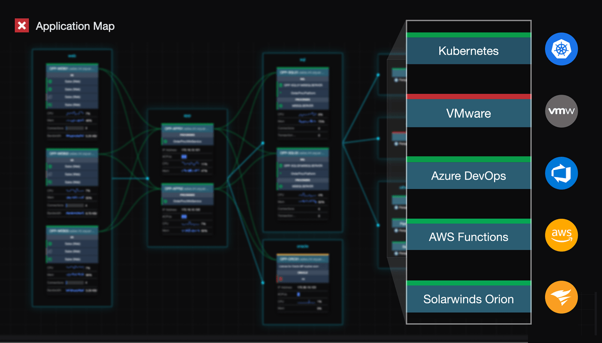
Find an example of the status blocks built with PowerShell in this Kubernetes monitoring dashboard.
So there you have some of my tips and tricks for visualizing data returned from a PowerShell script. You can find all the scripts for the tiles I’m showing here in GitHub.
SquaredUp, Technical Evangelist