


Vincent Babin
Senior Product Manager, SquaredUp
Senior Product Manager, SquaredUp
At SquaredUp, we are all about dashboards and visualizations that enable you to build the ideal single pane of glass.

If you work in monitoring, you know that designing the perfect dashboards that give you all of your important metrics at a glance, is easier said than done. Most of the time, it takes several attempts to optimize a dashboard for easy reading, and more often than not, this step is neglected. I wouldn’t recommend skipping over this step though. A cleaner looking dashboard helps you correlate information more quickly and effectively – allowing you to spot a problem immediately without having to dive into the details. More time reacting, less time interpreting.
With version 5.0, our new Dashboard Designer helps you achieve all that even more easily than before. With this release, we wanted to go the extra mile and give our customers even greater flexibility in building dashboards, while keeping it simple and saving plenty of time along the way. If you thought our dashboards were helpful before, wait till you try this out!
We often hear from our customers about how easy it is to create great dashboards using our intuitive Dashboard Designer, with our more advanced users leveraging the JSON editor to create the most compelling layouts. That made us ask ourselves: what if we could enable everyone to create the most amazing dashboard layouts without the need to use the JSON editor?
With our latest release, you don’t have to be a designer to whip up the most functional yet beautiful dashboards in SquaredUp.
The combination of purpose-driven, pre-built templates and infinitely flexible capabilities means that you get the best dashboard layouts and all the customization ability you could want. All while saving time along the way! Our new Dashboard Designer comes with a myriad of new tools, including:
Our User Experience and Engineering teams have taken great care to ensure that the new functionalities of the Dashboard Designer are built in a way that does not compromise the existing ease of use.
With version 5.0, you can create complex and interesting layouts more quickly and easily than ever before.
Let’s say our IT Director has asked us to update an existing management dashboard, by adding more compelling information – from the health of our services all the way to the status of the DevOps pipelines. Clearly, our IT Director wants all his/her interests represented in one dashboard. To do this will require a bit of creative thinking. How do we create a tidy layout whist trying to fit everything on one screen?
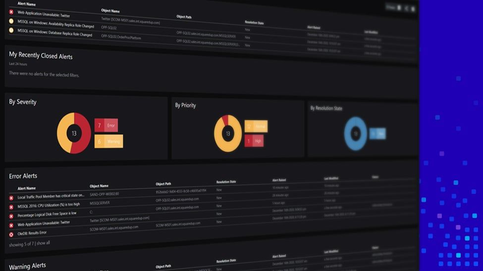
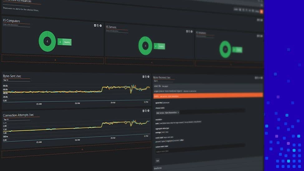
Below is the current dashboard that our IT Director is using: an overview of the most important business metrics linked to the uptime of our applications and IT infrastructure.

However, this layout does not paint the full picture, especially when it comes to user experience and other services that our IT Director cares about.
Let’s see how easy it is now to jazz up the layout and fit all the pieces of the puzzle into one screen.
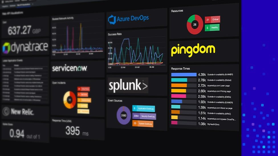
Here is the end result below. Achieving the desired layout took me less than a minute!

As you can see from the above video:
Plenty of time saved, and a beautiful dashboard to show for it – with all the info your IT Director could want!
Let’s now see what it’s like to create a brand new dashboard for our sales application.
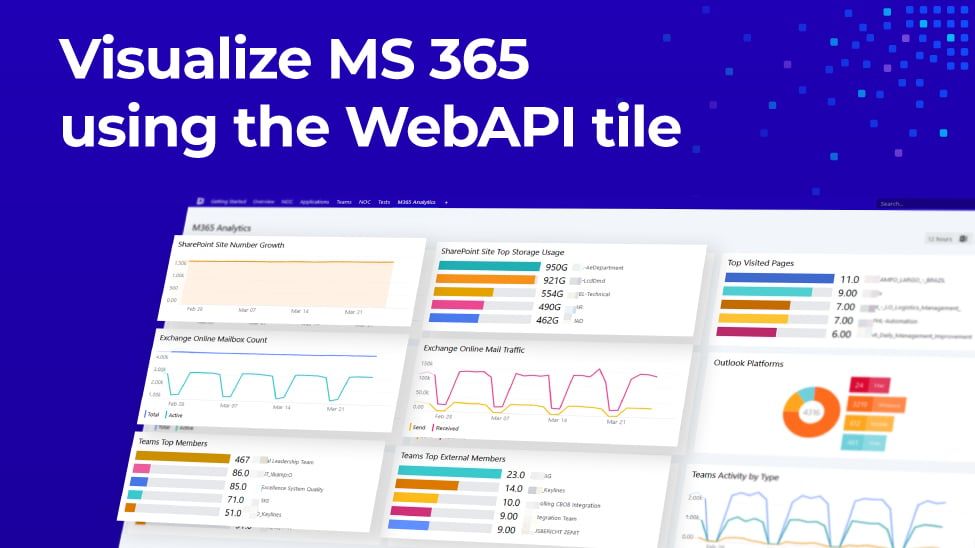
Let’s go ahead and create a new dashboard for our sales application. In this example, I am going to leverage our popular EAM features including VADA, as well as add context from external data sources to give me a single-pane-of-glass overview of my sales application’s health. All the while trying to create an appealing and easy-to-read layout with our new Dashboard Designer.
Let’s go!
And here is the end result (after configuring all my tiles).

As you can see from above, it took me less than a minute to build the layout that I wanted. Starting with our new template picker, I was able to control every aspect of the layout, whether that be adding tiles or splitting tiles to create more space.
Lastly, you may have noticed the new look & feel we are introducing in SquaredUp version 5.0. We’ve implemented better contrasts in your visualizations, a new range of vibrant heatmap colours, a darker dark mode, and a cleaner feel all round! The new colours are distinctly SquaredUp: modern, fresh and focused. Not only is it easy on your eyes when you’re in front of the screen for endless hours, you can now see your data more clearly at a glance, with these clear, simple and beautiful dashboards.
We can’t wait for all our customers to experience our new Dashboard Designer.
If you’re an existing SquaredUp user and want to start using the new Dashboard Designer, you simply need to upgrade to version 5.0 by heading over to SquaredUp downloads. See SCOM / Azure upgrade documentation for help.
For more information, check these useful resources:
Thank you for reading this blog post. More blogs about version 5.0 will be available soon. Stay tuned for more in the coming weeks!
Senior Product Manager, SquaredUp