Vincent Babin
Senior Product Manager, SquaredUp
Senior Product Manager, SquaredUp
Being able to visualize data from all of your tools in a unified dashboard experience has become critical to most enterprises today.
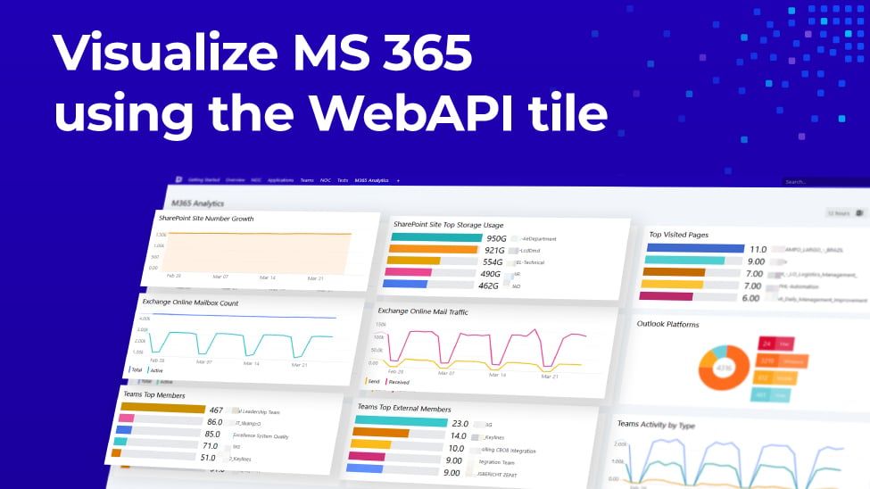
With SquaredUp dashboards, you can not only correlate data from SCOM and Azure, but also surface critical information from your other tools and data sources – including ServiceNow, Azure Log Analytics, App Insights, all SQL databases and any Web API.

In short, you can get unified dashboards with real-time operational intelligence for all teams across all tools. This helps break tool silos and enables proactive and efficient problem-solving when an application or a piece of your infrastructure goes down.

With our latest release SquaredUp 5.0, we have added a range of new visualizations and integration capabilities to our Web API tile, which is fast becoming more and more like the Swiss Army Knife of dashboard tiles. Whether it’s Solarwinds, Azure DevOps, ServiceNow, Dynatrace or the tool that your enterprise has deployed, you can now create beautiful 360° dashboards across all your tools, even more easily. Let’s take a look at how it works, what makes it so powerful, and what you can do with it – using three key real-life examples!
A few months ago, we sent out a survey to our customers to find out what visualizations they wanted to see with the Web API tile. We received many responses and the result was clear. Our customers wanted to visualize non-SCOM monitoring tools, deployment tools, and alerting tools in line graphs, donuts, and bar graphs.
With version 5.0, we delivered exactly that and more:
These improvements, along with the new Dashboard Designer released in version 5.0 mean it’s now easier than ever to quickly build dashboards with compelling visualizations, from just about any tool that supports a REST APIs. This in turn gives you the ability to build the ideal unified dashboard by bringing more context to your existing SCOM and Azure dashboards.
In the next few sections, we are going to look at the real-life examples of how we were able to create unified dashboards for various teams at SquaredUp.
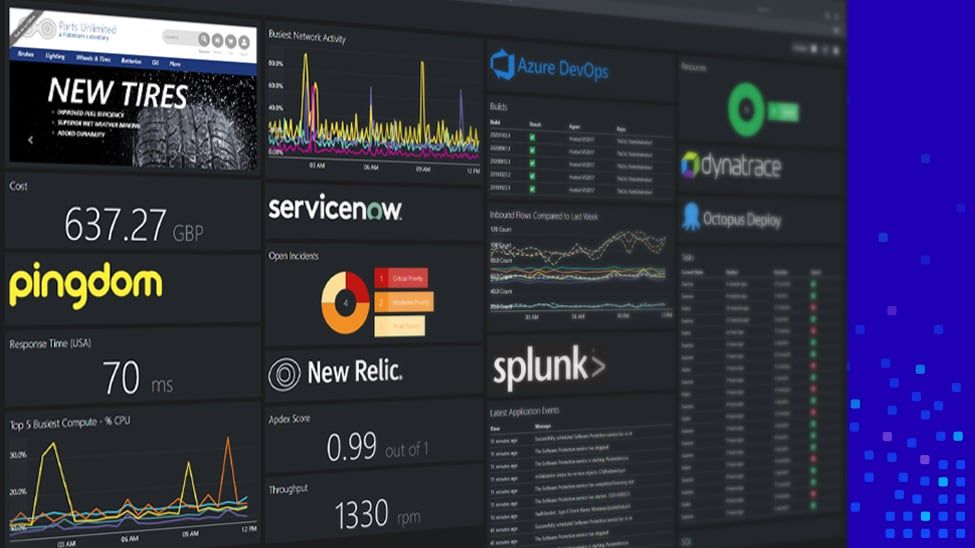
In this example, we are going to look at our sample e-commerce Sales App dashboard. To build a unified dashboard that our ITOps, DevOps, and Support teams can use daily, we need to visualize a number of pieces of critical information:
To be able to answer these questions in real time and keep a pulse on the health of our application, we built the unified dashboard below using VADA (our popular tool for application discovery, mapping and dependency), which gives us a health status roll-up, SLA, and a map showing the status of all the dependencies. We also brought together information from external tools such as PagerDuty, Zendesk, Azure DevOps, and Pingdom to complete the picture.

Let’s take a look at the visualizations of data from our external tools:
Let’s take a quick look at how we leveraged some of the new features of version 5.0 to visualize our incidents overtime from Pager Duty on the new line graph:


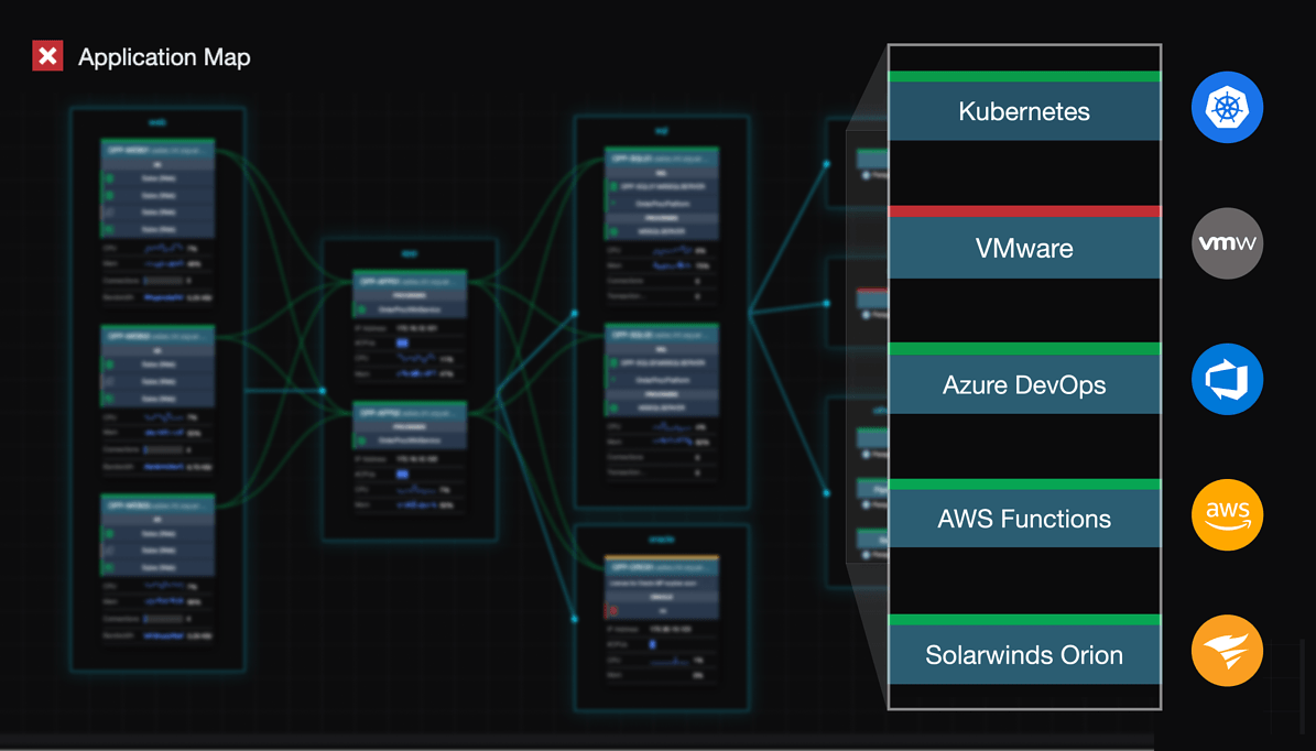
The dashboard below is typically used in an operations centre on a wall screen or by support and service operators to monitor at a glance how the services and applications are performing.

It shows critical information, including:
In a nutshell, this dashboard will show red when things are not quite right, or green when things are running optimally. A unified dashboard from which we can be proactive and take the best course action to remedy any problems that crop up.
Let’s take a look at how we were able to use the new Web API features of version 5.0 to build this unified dashboard:


Perspectives in SquaredUp offer a quick and easy way to create a dashboard just the one time, and then have it work across multiple objects of the same type. The example below is a server perspective.

If we take a closer look at the Memory Usage tile, this information is actually coming directly from Solarwinds. If I were to navigate to another server, the same dashboard would show the same information but from that server. To do this, we parameterised the Web API search query to include the dynamic name of the object that the perspective is targeted at.

In the various examples above, we have seen how easy and flexible version 5.0 helps add useful context from external tools to existing SCOM and Azure dashboards.
Along with the new dashboard designer and the new Open Access available in version 5.0, it is now easier than ever to create and share unified dashboards inside your organization. Ultimately, version 5.0 helps you make better decisions and enables more collaboration across your teams. As a result, it empowers you to be quicker and more proactive when reacting to issues that can significantly impact your users and business.
We can’t wait for all our customers to experience our new Web API tile.
If you’re an existing SquaredUp user and want to start using the new Web API capabilities, you simply need to upgrade to version 5.0 (see SCOM / Azure upgrade documentation for help). Head over to SquaredUp downloads to get version 5.0.
For more information on installation, upgrades and more, check these useful resources:
Thank you for reading this blog post. Check out our blogs on the updated Dashboard Designer and Open Access to learn more about version 5.0. Stay tuned for more in the coming weeks!
Senior Product Manager, SquaredUp