

Aggregating and Visualizing Data with Kusto
Got the basics down and ready to move on to more advanced aspects of Kusto? You’ve come to the right place! Here you will learn how to use aggregation functions, visualize query results, and put your data into context. If you’re just getting started with Kusto, check out our ‘Jumpstart Guide to Kusto’ before starting on this one. Let’s get into visualizing data with Kusto!
Using Aggregation Functions
Having done the testing for the Log Analytics and App Insights tiles, I thought I’d jot down the things that weren’t immediately obvious to me when I first started out with KQL in the hope that it might help someone else who is currently at a similar level of understanding.
At the end, I’ll show you how to do the same things in SquaredUp.
To start, I thought I’d take a bit of a deeper dive into aggregate functions and show how aggregating data is a key stepping-stone to making sense of the data, using visualizations in the Azure Portal and in SquaredUp.
If you’ve had a chance to read our 'Jumpstart Guide to Kusto', you’ll be familiar with the concept of aggregate functions and how the summarize keyword is used to invoke them in a query. These functions are super powerful and allow grouping and counting of records based on parameters that you supply.
A common aggregation function is count(). When we use this function as part of a summarize statement, we can split our data up into distinct groups and then count the number of records in each group. There are good examples of this in the Kusto 101 blog such as this one where, for each distinct conference value, we’re going to count the number of instances of that conference value in the ConferenceSessions table.
ConferenceSessions
| summarize count() by conference
There are a couple of variations of the count function which are similarly useful such as dcount(), which allows you to count the number of distinct rows in a column and dcountif(), which allows you to count the number of distinct rows in a column where a given field has a specified value. An example of dcountif() might be to get the number of distinct computers where a particular event occurred in the last hour, and to do this all we have to do is specify which column we want to count the unique values from (Computer in this case) and a condition to match before the row is included in the count (where the EventID column value matches 7036 in this example).
Event
| where TimeGenerated > ago(1h)
| summarize dcountif(Computer, EventID == 7036)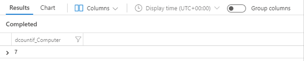
UpdateSummary
| summarize arg_max(TimeGenerated, TotalUpdatesMissing) by Computer
| project Computer, TotalUpdatesMissing
Let’s dive a bit deeper into the query syntax here. Summarize statements can get a little complicated sometimes, so what I like to do is to read them from what comes after the by keyword first so I can get a clear idea of what they’re doing:
by ComputerGroup the rows in the UpdateSummary table so that each group only contains rows for a single Computer
arg_max(TimeGenerated, TotalUpdatesMissing)Visualizing our query results
If we tag a render statement on to this query and run it in the Azure Portal, we get a nice visualization of our servers that are missing updates.
UpdateSummary
| summarize arg_max(TimeGenerated, TotalUpdatesMissing) by Computer
| project Computer, TotalUpdatesMissing
| render piechart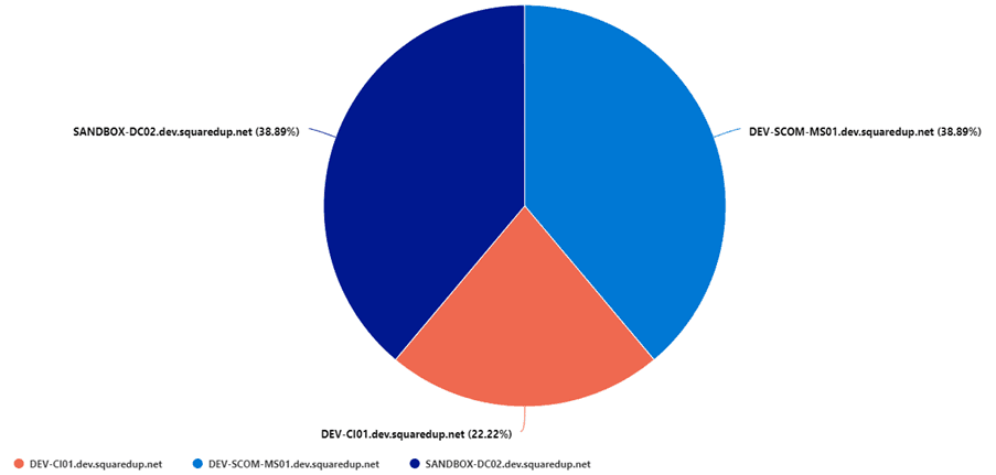
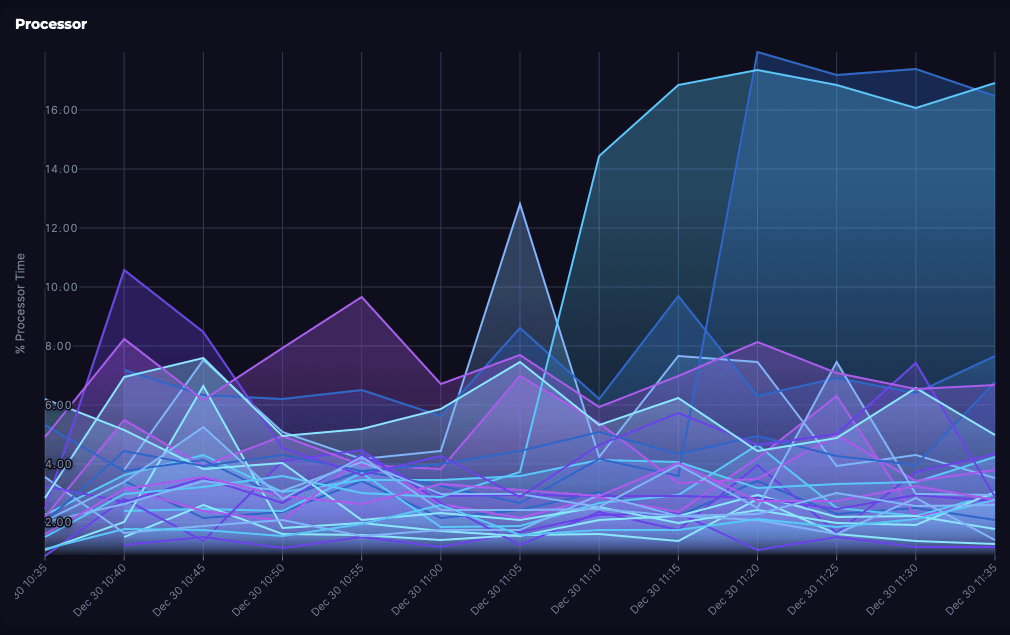
Visualizations can really help make sense of Azure data, and I think this is especially true of time series data. Monitoring server performance is an example use-case where aggregate functions and visualizations can really give a clear picture of what’s going on with a few lines of KQL.
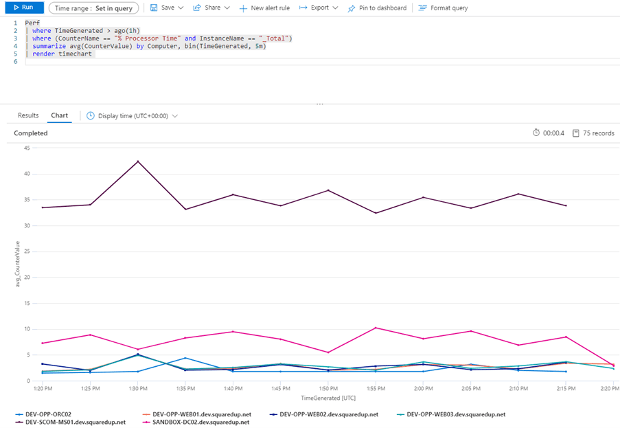
Perf
| where TimeGenerated > ago(1h)
| where (CounterName == "% Processor Time" and InstanceName == "_Total")
| summarize avg(CounterValue) by Computer, bin(TimeGenerated, 5m)
| render timechart
It’s just a few lines as I said, and most of the power is in the summarize line. Stepping through it from the by keyword again:
by Computer, bin(TimeGenerated, 5m)Separate the rows passed in from the two where statements into groups of rows that share the same computer name. For each of those groups, the bin() function is going to round the TimeGenerated value in each row down to the nearest 5 minute interval and add it to a bin of rows that share the same 5 minute interval.
avg(CounterValue)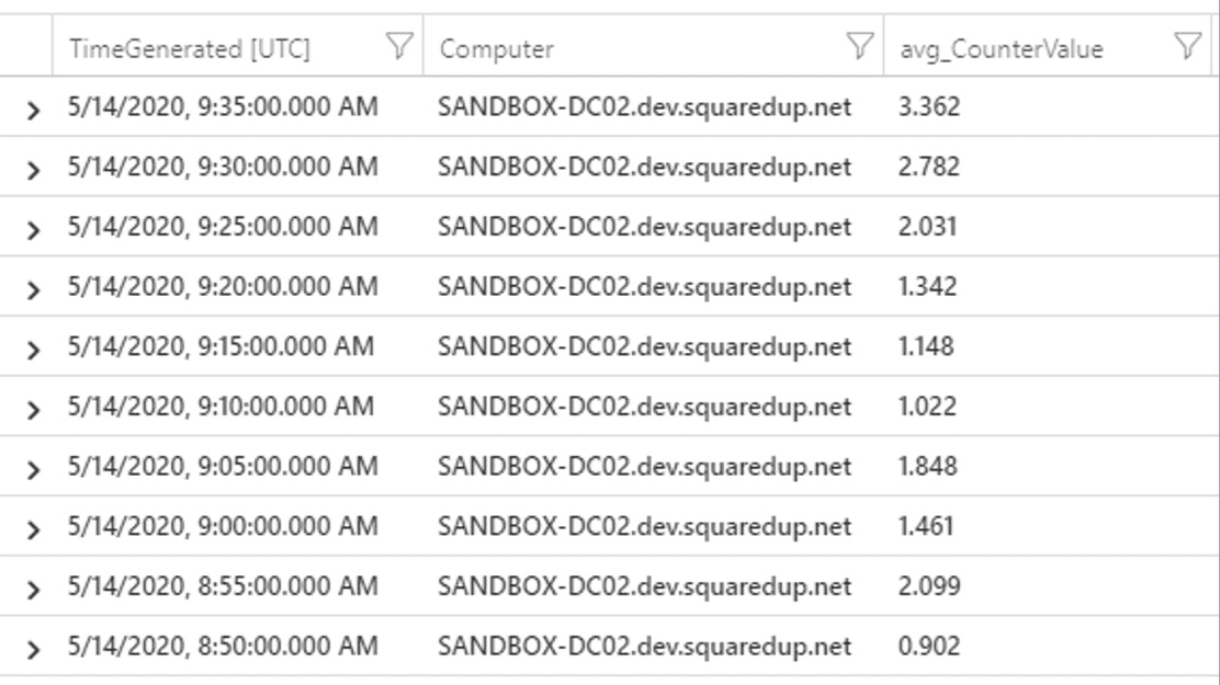
We can render this into a nice time-series line graph in the Azure Portal using the render keyword together with timechart, showing us how average CPU for each server has changed over the last hour.
Datatypes and how they affect visualizations
Azure Portal visualizations are easy to use because the Azure Portal automatically tries to work out which column goes where in the selected visualization. It does this by looking that datatype of the columns that are being passed to it.
To draw a time series graph, we need a minimum of two columns, one containing timestamps and the other containing numeric values. Optionally we might also want a column containing string values for the legend. If you’re going to create a pie chart, then you’re going to need a column containing string values for the legend and a column with numeric values to populate the chart.
If your data doesn’t meet the datatype requirements of the visualization then you’re either not going to get what you expected, or you’ll get an error message. Sometimes it’s not obvious that you’re missing an expected datatype. Take this query for example:
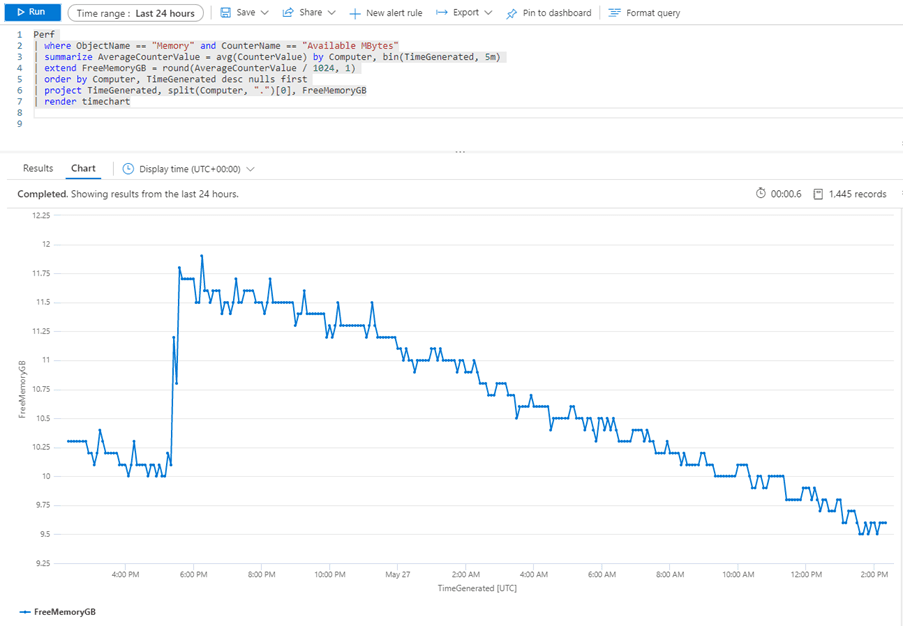
Perf
| where ObjectName == "Memory" and CounterName == "Available MBytes"
| summarize AverageCounterValue = avg(CounterValue) by Computer, bin(TimeGenerated, 5m)
| extend FreeMemoryGB = round(AverageCounterValue / 1024, 1)
| order by Computer, TimeGenerated desc nulls first
| project TimeGenerated, split(Computer, ".")[0], FreeMemoryGB
| render timechart
In this query I want to do the same thing as the % Processor Time query from earlier, but this time I’m using the extend keyword to create a new column that converts the free memory value to GB and rounds it to one decimal place. I don’t want the fully-qualified server name, I just want its NETBIOS name so I’ve used the split() function to split the Computer value into chunks and then asked for the first of those chunks ( the chunks start at zero, hence [0] for the first one). However, the Azure Portal only shows me a single line in the line graph even though I know I’ve got more than one server:
The reason for this is that some functions like split() change the datatype of the column to a dynamic datatype that the Portal visualizations don’t know what to do with. Fortunately, there’s an easy way around this because KQL provides some datatype conversion functions. If I use the tostring() function around my split operation to convert the dynamic datatype to a string then I get what I want.
project TimeGenerated, tostring(split(Computer, ".")[0]), FreeMemoryGB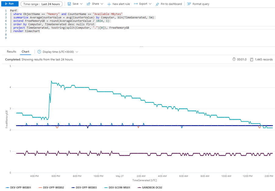
These datatype conversion functions are useful, because there may be situations where you have a timestamp stored as a string, but you want to use it in a time series chart (todatetime()) or you have an numeric value you want to use as a label (tostring() again).
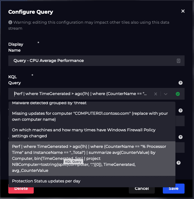
If you’re using SquaredUp for your real-time Azure monitoring, then you can simply copy/paste the query from Azure Log Analytics right into the dashboard UI as shown below.
Putting our data into context using SquaredUp
The great thing about SquaredUp is the ability to pull in other data to provide better context. So if I add the Free Memory query and the Missing Updates query we looked at earlier to my dashboard, then we can get a more complete view of my servers. I’ll admit that the Missing Updates Donut might be a tiny bit out of place on this dashboard, but who doesn't love a good donut?
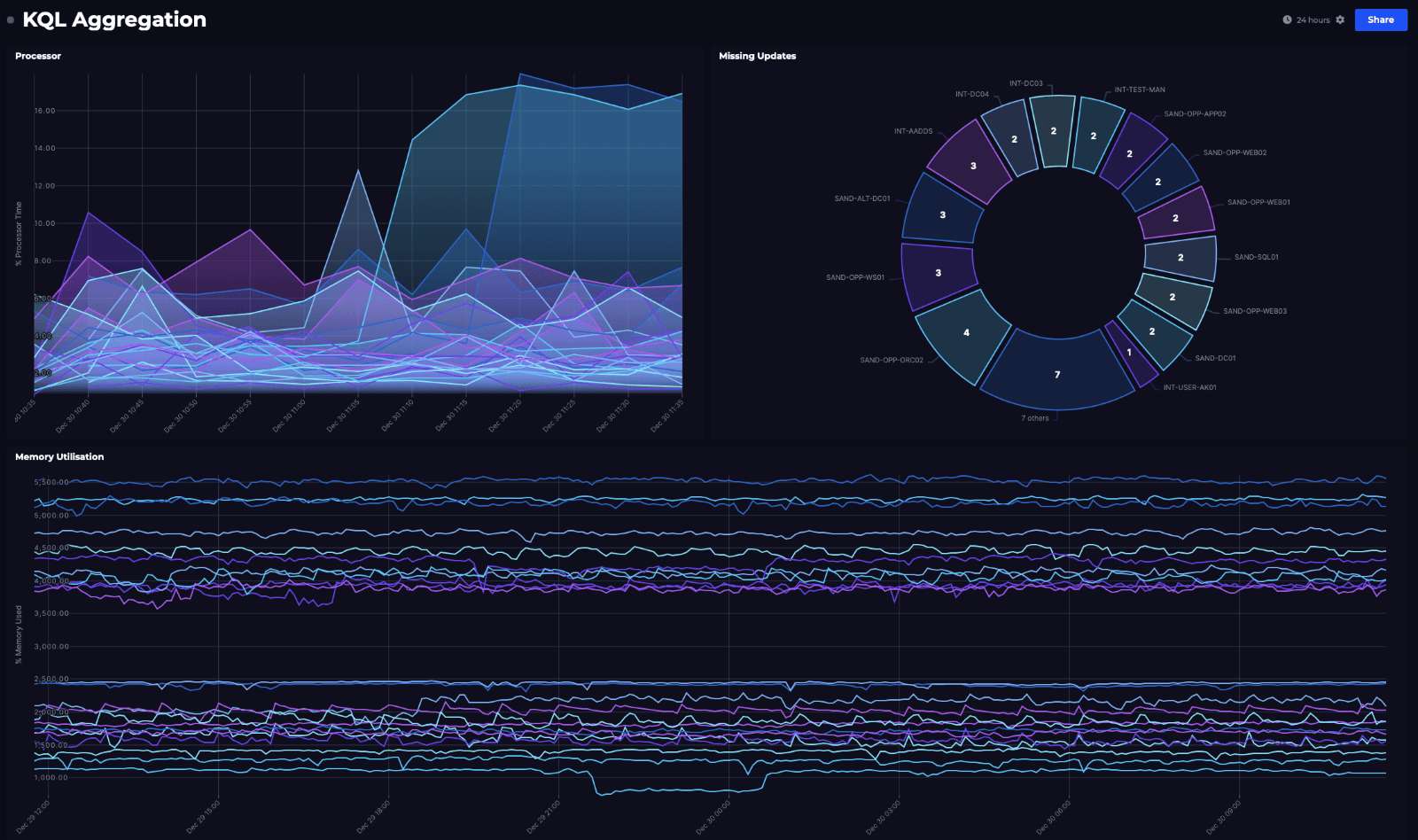
Not bad visibility into what our servers are doing, with just a few lines of KQL! The queries in these tiles will execute every 60 seconds and update the visualizations with the new data, so we should be able to quickly spot if anything is amiss.
Setting these up in SquaredUp
The KQL functionality I’ve shown above is available in our SquaredUp dashboard product.
One of the strengths of SquaredUp is its ability to pull in data from multiple sources, using 60+ plugins to visualise it all in one place.
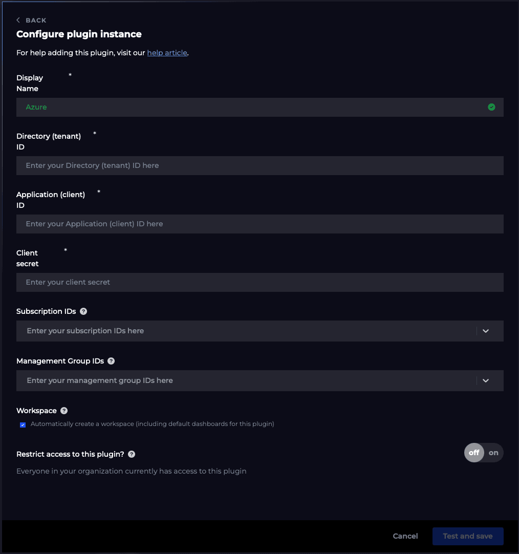
As SquaredUp is platform-independent, you first need to setup a connection to your Azure tenant using our Azure plugin setup wizard. You can add as many Azure plugins as you need for permissions and data access purposes.
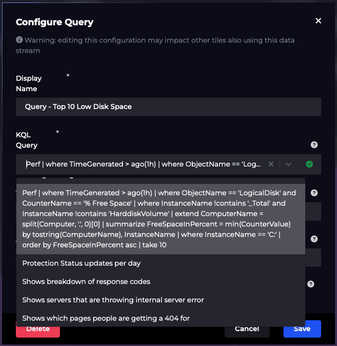
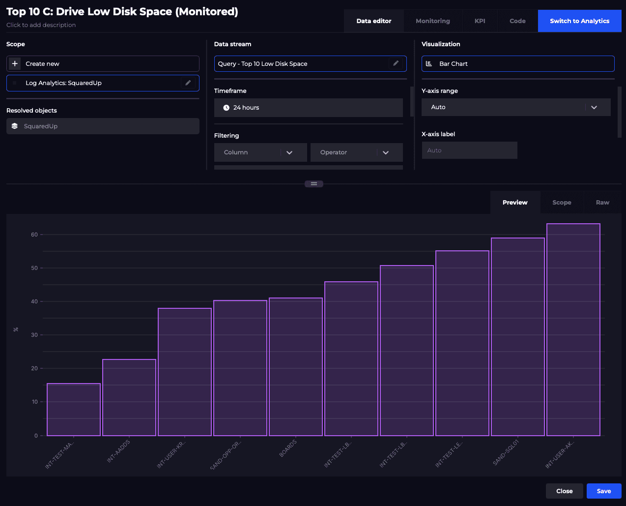
Once this has been done, SquaredUp will start indexing all the resources it can find (e.g. workspaces, VMs, etc) to scope against and fetch out-of-the-box metrics, saved queries and your own KQL queries. For example, getting the top 10 drives with the lowest disk space and visualising it as a bar graph:
Start dashboarding with SquaredUp, free forever.
As I’ve hopefully shown, Kusto is both relatively simple to understand and useful when trying to do simple aggregations of data. However, it also provides some other more complex aggregation functions, and quite a few of them have an “if” equivalent in the same way that dcount() has dcountif(). Personally I think stdev(), percentiles() and variance() are pretty interesting functions. Calculating the Standard Deviation (stdev()) for say % Processor Time using data from the last 30 days seems like a good way of objectively working out if a server is under more load now than it has been historically.
Using percentiles() and variance() in the same way could also give us an idea of how busy a server is normally, and whether it is uniformly busy as opposed to being prone to sudden usage spikes. I just test software though, so I’ll leave it to you to decide whether they’re useful in the real world!
I hope you've found this useful. My next goal is to better understand table joins in KQL and how to import custom logs into Log Analytics – maybe it’s possible to import SquaredUp logs into Log Analytics and then visualize it with SquaredUp! I better prepare myself for Inception-level stuff with that one. If I succeed, and crucially if I live to tell the tale, I’ll be back with another post to tell you all about it.
Related plugins

Azure App Insights
Monitor your Azure Application Insights environment using custom Kusto queries.
Azure
Monitor your Azure environment, including VM, Functions, Cost and more.
SquaredUp has 60+ pre-built plugins for instant access to data.
Related content
Dashboard Story
Visualizing key Azure infrastructure metrics
Dashboard Story