Adam Kinniburgh
VP Innovation, SquaredUp
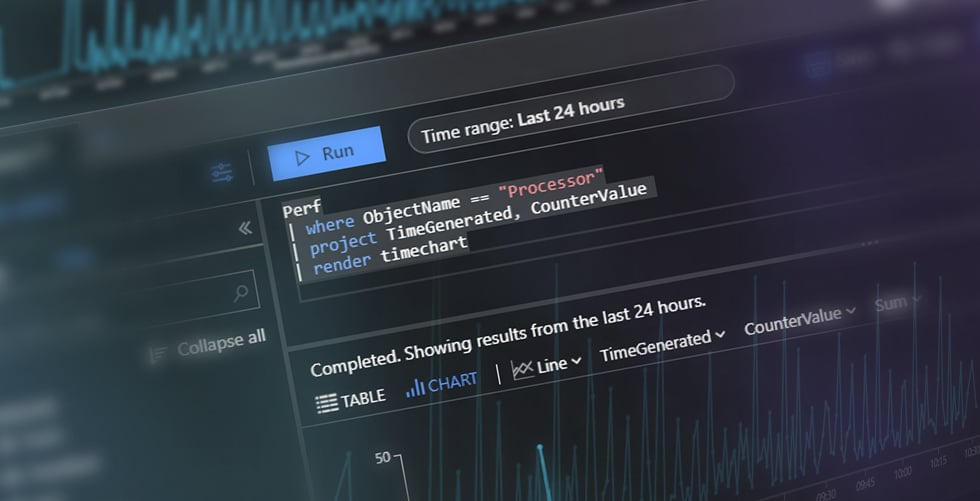
This SquaredUp dashboard uses the Azure plugin to surface and visualize data stored in Log Analytics. We can query, summarize, and analyse the data stored in your workspaces via KQL queries.
Accessing data stored in a Log Analytics workspace isn’t a difficult task in the Azure Portal, but building a dashboard to bring together the results of many queries can be challenging. Getting that dashboard into the right hands can also cause headaches for your security team.
Being told when a metric is outside of its normal threshold, or the number of unexpected entries in a table exceeds a limit, is also a vital step in a thorough monitoring approach, but Azure Alerts come with a cost and are cumbersome to configure.
It's also not unusual in a world of complex, distributed data that each dataset might be stored in a different Log Analytics workspace, and even in different regions, subscriptions, and tenants. Getting a singular view or compiling a complete dataset is, therefore, often out of reach with the native tools.
SquaredUp lets you build a state-of-the-art Azure Log Analytics dashboard with ease. By using configurable KQL data streams you can query, summarize, and analyse the raw logs and traces being stored in your workspaces. You can even bring your favorite saved queries directly into SquaredUp and see results immediately.
When you’re building a dashboard in SquaredUp, there are never any tool-specific steps to take to craft the perfect visualization, regardless of the data source. Displaying the results of a complex KQL query doesn’t require any heavy lifting. Then, when you need to take that a step further to calculate averages across different time periods or combine metrics into a single graph, it’s just a couple of extra clicks to bring more data into scope and get your answer.
SquaredUp also breaks down the silos that Azure creates between different Log Analytics workspaces. When getting your answer involves aggregating complex data sets from multiple tables, our SQL Analytics feature lets you bring in those disparate data sets and work with them using a familiar query language to create a new unified output.
As the possibilities created by Log Analytics are vast, the dashboard you want to build could be entirely unique. Fear not though, the method used to create this example dashboard is universal, regardless of the queries you’ve got in mind.
The five tiles shown are powered by just three queries, using data from the Azure Monitor for VMs (InsightsMetrics) and Security Center (ProtectionStatus) solutions. SquaredUp’s aggregation, filtering, and sorting features have then been used to group and summarize that data into different visualizations.
The “Disk Space” tile is powered by a simple query that returns free disk space percentage for the given time period, from the 'InsightsMetrics' table.
InsightsMetrics
| where Namespace == "LogicalDisk"
| where Name == "FreeSpacePercentage"
| summarize avg(Val) by Computer, bin(TimeGenerated, 15m)
The raw data includes columns containing the value, the computer name, and the timestamp for when that datapoint was created. This perfectly fits the line graph tile to give a view of disk space over time.
In this scenario though, we want to surface the lowest value from the dataset, so we’ve configured the tile to group the results by the computer name and then provide only the “min”, or minimum, value. This now fits the bar chart visualization and makes it simple to spot those low values.
In the “CPU” tile, we’re using the same 'InsightsMetrics' table, but the table is being filtered to the Processor namespace, with the UtilizationPercentage metrics being returned.
InsightsMetrics
| where Namespace == "Processor"
| where Name == "UtilizationPercentage"
| summarize avg(Val) by Computer, bin(TimeGenerated, 15m)
In this case, we’ve left the visualization as the line graph, to track CPU utilization over time and spot any spikes or dips that might be unexpected. As with the disk space tile, we could group and aggregate this data to suit other purposes.
The three tiles along the bottom row, covering summary information about the monitored computers, is taking data from the 'ProtectionStatus' table, using just one query.
ProtectionStatus
| summarize arg_max(ComputerEnvironment, OSName, ThreatStatus, SignatureVersion, TimeGenerated) by Computer
In this case, the query returns only the latest value for each computer, including a number of key pieces of information. The table visualization is the default here as the results are primarily text, but we’ve further summarized the data by grouping on different columns so that we can better present the data we want using the donut tile.
As this dashboard makes use of custom KQL queries, it isn’t included as standard as part of the Azure data source, but creating it yourself is quick and easy.
To see what other dashboards you can create, including Azure dashboards, check out our Dashboard Gallery.
Monitor your Azure environment, including VM, Functions, Cost and more.

Monitor your Azure Application Insights environment using custom Kusto queries.
SquaredUp has 60+ pre-built plugins for instant access to data.