Design a dashboard with metrics that matter to you

We all know that SCOM is a monitoring powerhouse, but even the biggest SCOM fan can’t deny that the SCOM Console dashboards leave much to be desired. They might look colorful, but unfortunately there’s not much else they can do. You can’t drill down further into an object, and you definitely can’t correlate it with other data you might have on that object that could be related.
SquaredUp’s SCOM dashboards check all those boxes. Let’s take a look at them side by side.
SCOM Console vs SquaredUp dashboards
Below is an example of a fairly standard NOC dashboard.

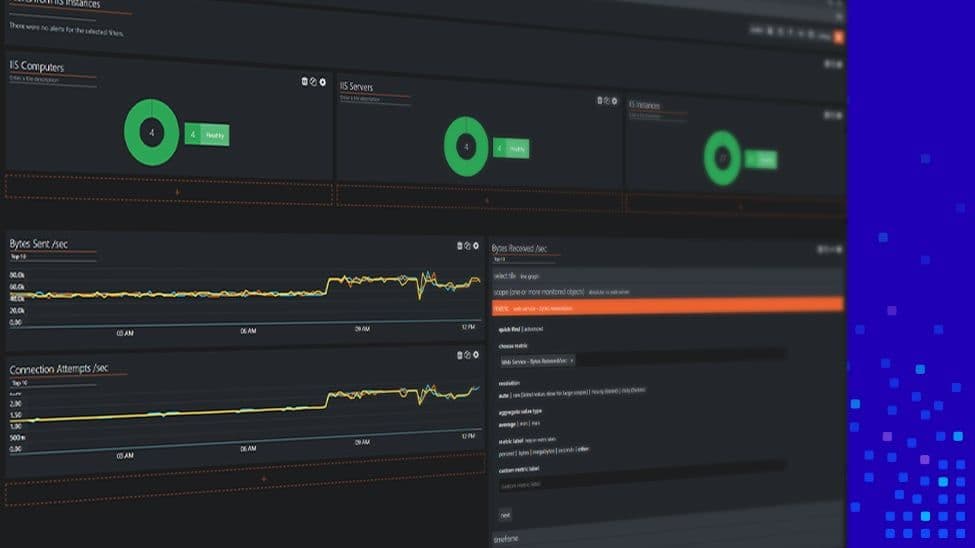
Now here’s an example of a SquaredUp dashboard. In a fresh install of SquaredUp, there are a bunch of dashboards out-of-the-box. The NOC dashboard is one of them.

There’s a very helpful set of visualizations to glance over everything wrong in the SCOM deployment. In addition to the high-level donut summaries of alerts and server health, there’s also a list of all alerts, like what you see in the SCOM console.
Comparing the two, the SquaredUp dashboards not only look nicer, but are much quicker and very easy to create. The SquaredUp dashboard designer allows you to adjust the height, width or position of the tiles very easily. And no scroll bars in the tiles!
The best thing is that all of this is actually drill-downable, and it can also bring in incidents from the ITSM tool of your choice to go along with the alerts data. Now that is fantastic!
And this is just the tip of the iceberg. Learn about all the ways you can elevate your SCOM monitoring, from performance monitoring to getting that single pane of glass for all your tools.
If you’d like to see how exactly SquaredUp can work for you, take out a 30-day free trial using the form below or book an introductory call with one of our technical team.


