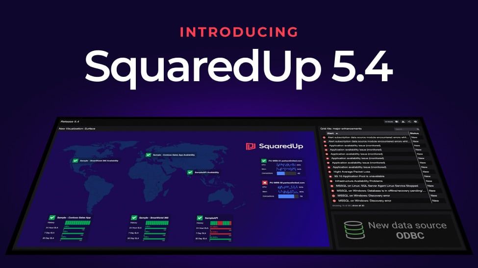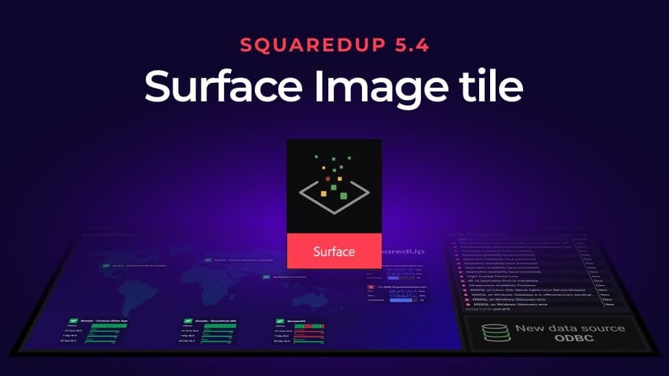
SquaredUp 5.4: New Surface image tile
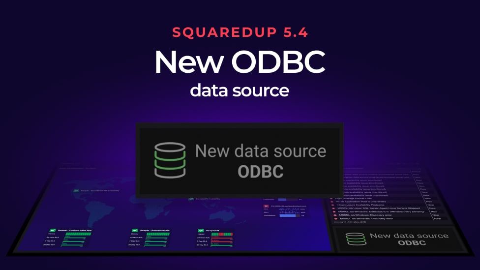
We just released the new SquaredUp 5.4 with some brilliant new features. Headlining as the two biggest updates were the new ODBC data source and a new visualization – the Surface image tile.
The Surface tile lets you build stunning dashboards with any image.
(If you missed the release announcement you can catch up by reading the quick overview blog post which includes the full release webinar.)
With SquaredUp 5.4 Surface tile, you can now visualize any of your SCOM or Azure data on top of any image and easily customize the look and feel.
Overlay data on any image
Do you need to show where in the world your Operation Centers are located and what their health state is? Overlay health metrics on top of a world map.
Want to show the cause and effect of troubleshooting on your topology? Overlay your IT metrics on a topology diagram.
Or perhaps you need a dashboard for your boss with concise summaries of application KPIs in a tidy diagram. The Surface tile lets you do that too.
You can even use a map of your buildings to overlay information, like Wi-Fi connections on each floor.
The Surface tile comes with huge flexibility, and we can’t wait to see how you are going to use it.
Remember you can submit your dashboards to us for the chance to win brilliant LEGO® prizes and be in with the chance of becoming the Community Champion.
Build your creative visual
All you need is an image and SCOM or Azure data, and you can build some incredibly creative dashboard visualizations.
Maps
Here, we have a world map. Floating on top are objects and the metrics that come from those objects.
You can place the objects and metrics anywhere on the image you like, so you have total flexibility.
Topology
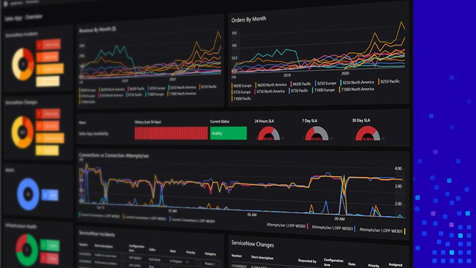
Shawn also demoed the Surface tile for KPIs for a database team that could be displayed in large on a wall board. This has two Surface tile visualizations that you can send to you CIO to give them an overview of KPIs.
The same can be done for multiple teams. Below, we have a topology overlay for three teams – Databases, Ops Manager Management Servers, and Web User Interfaces. Then across the top are the SLAs.
Each of the SLAs are pieces of the infrastructure you can roll up into a different dashboard.
To go one step further, give each team their own dashboard to manage and then you can wrap all those dashboards up into one Surface tile visualization and the changes they make on their own team dashboards are then reflected in the rollup dashboard.
The flexibility of the new SquaredUp Surface tile lets you present information in a huge number of new, impactful ways.
Tree view
A third option is the tree view for your boss.
Again, drag the metrics anywhere on the tree image.
This tree view visualization is showing database metrics, Windows metrics, and IIS metrics. With Surface tile, you can display the data you need.
Choose your perspectives
You’ll be interested to know that, if you click on the dropdown arrow on an object, when in edit mode, you can see the perspective box. This, just like with a Matrix Row tile, lets you create custom perspectives, save them to a file, and they become available for use here.

Select the perspective you want, and the data automatically updates.
Hide metrics from view

The tick boxes that appear next to the metrics in edit mode allow you to deselect metrics, which will hide that metric from view. This may be helpful if, for example, you want to hide your IP address because you’re sharing the visualization more broadly.
This gives you a lot of flexibility to manage how your metrics are viewed on screen.
Customize your look and feel
SquaredUp 5.4 Surface tile also gives you the option to customize the design of your dashboard with options like:
- Light and dark modes
- Object size for objects on top of the image
- Opacity of objects
- Label positioning
- Displaying the object name
- Collapse mode
- Resizing the tile as needed, and everything inside resizes
You can mix and match what metrics you’re looking at on the same image to create unique views too. Th e below example of a building floorplan has one object that displays just the bandwidth and another that displays both connections and bandwidth.
You could even make the map interactive. In the next example, we have health statuses in a red x or a green check. But when you click on it, it expands to show more detail.
Visio vs. Surface tile
The new Surface tile does seem to do some of what the Visio tile does, but there are differences.
If you have a simple, clear image and fewer than 25 objects to map, use the Surface tile. You can very easily view, add, subtract, and move objects on the image. The surface tile will probably replace most of your Visio use cases as it’s so much quicker and easier to build.
However, if you have strange shapes you want to map statuses onto and a large number of objects, Visio wins out. Visio uses an SVG file, so you’re limited by how the image lights up or not and you have to go into Visio to re-link the object, save the SVG, and reimport it into SquaredUp every time you edit it. So there’s more overhead when objects change.
Here’s a Visio tile on the left and a Surface tile on the right for comparison.
Now go and create
So, there you have it – a quick run through the amazing new Surface tile in SquaredUp 5.4.
Hopefully there is plenty of inspiration here now for you to go and create your own stunning dashboard visualizations on images.
Remember to share your creations with us to be in with the chance of winning some great LEGO® prizes.
Visit the 5.4 release blog post for a quick overview of the other new SquaredUp features and get started with SquaredUp 5.4 today.