Bruce Cullen
Director of Products, SquaredUp

Director of Products, SquaredUp
Hot on the heels of version 6.0, this DS for SCOM release brings a raft of highly requested quality of life updates. We hope they make using Dashboard Server even more productive and enjoyable for you!
For the complete list of updates, check out the latest release notes.
Read on for a quick overview of the main feature improvements or click into the items that interest you in the contents list above.
Alternatively you can watch the recording of the release webinar presented by our Director of Product and Engineering Bruce Cullen.
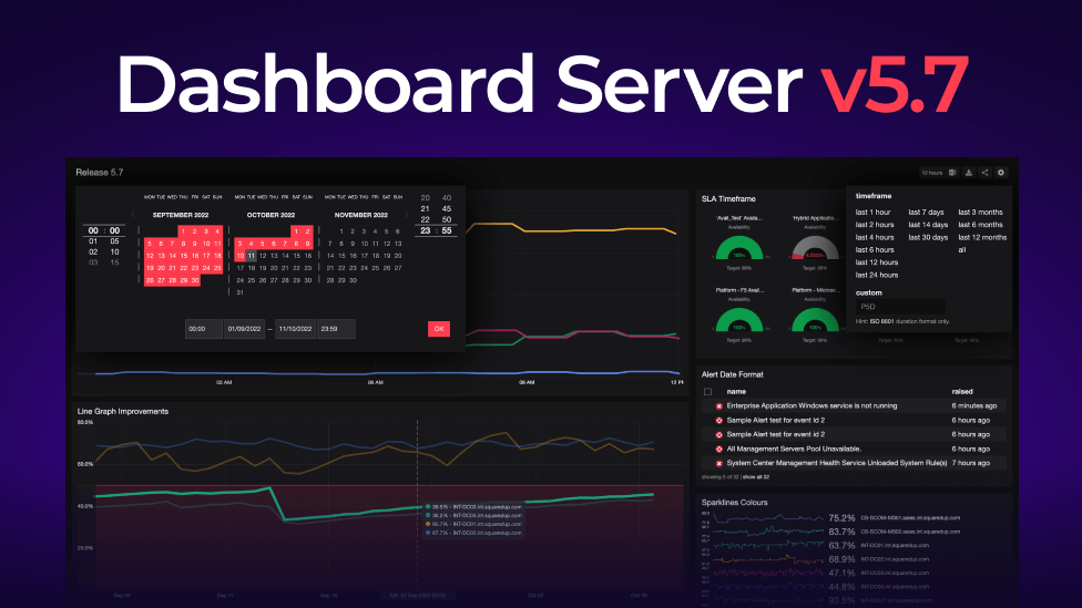
The line graph is an important feature – being the bread and butter of seeing performance data from SCOM and other sources. We are excited to share that trend lines are now available on the line graph!
In the display panel, there is a new checkbox for trend lines, and we can adjust how far into the future we'd like the projected trend to extend.

This is a helpful change for understanding why something is in the state it's in, and where things could potential go, rather than just displaying the data.
We have also improved the context provided in alerts for EAM-X. For those who are unfamiliar, EAM-X is the tier of Dashboard Server that brings you the benefits of both our cloud product (SquaredUp Cloud), and Dashboard Server. Our cloud product connects to over 100 data sources, extending your reach far beyond SCOM. Via a management pack, we are then able to pull down the cloud product's notifications into SCOM – giving you the best of both worlds.
This is what an email notification from the cloud product looks like – it includes a preview screenshot and links to drill down into the data in question. Very helpful!
However, up until this release, while it worked fine, the SCOM alert we would raise from this SquaredUp Cloud alert didn't look great. You'd have to infer or drill down into SquaredUp Cloud to get the answer.
In 6.1, alerts in SCOM pulled from your cloud notifications are a lot more helpful. We've sanitized the names for monitors and titles, and added helpful descriptions. All of the context is displayed in the SCOM UI, which means you don't have to drill down into SquaredUp Cloud to understand what's going on.


Haven't we all accidentally made changes to a dashboard? This new feature allows all page edits to be undone or redone. A small but mighty feature update!


In 6.0 we released auditing as a new feature. In 6.1 we have continued to make a few further quality of life improvements.
In the initial launch of the Auditing feature, you could search for a user, some content, enterprise applications, or team folders – but you could not search for folders. We received feedback that this wasn't ideal as sometimes users knew the folder in which a dashboard was saved, but not necessarily the name of the dashboard itself. We've now added the ability to search for a folder!
In 6.0, the team folder name wasn't always displayed for a piece of content. As per the screenshot below, sometimes "default user-created" would be displayed instead. This wasn't helpful in cases where it was important to see the team folder name – perhaps when you had moved the dashboard between team folders, and needed to see the change.
With 6.1, you can now see the team folder name when looking at your audit events.

In 6.0 you could only filter by a single event type at a time. Now, you can add as many different types as you like, giving you a lot more control without having to fall back to the raw SQL data. This makes sifting through audits a lot easier.

This is perhaps one of our most-requested features over the last 4-5 years. While it is a seemingly minor change, it's no doubt going to have a significant impact for some customers.
Up until this release, we displayed time in the 12h clock format. However, in some countries, a 12h clock format simply isn't used. This change will help improve the user experience for people in those regions, especially in cases where the dashboards are shared with the wider business, beyond the core admin team.
Up until this release, si units were the only option for number formatting. We have now added options for both small numbers and large numbers.
A large number like 600,000 would previously have been displayed as 600k by default. Users can now select to display the number with a separator. This also adds a larger degree of precision, as we'd no longer be rounding to the nearest 1,000.
Small numbers refers to anything smaller than 1. Previously, a milli or a micro unit would have been displayed, which may or may not be the most helpful for your use case. The new option of decimals could be significantly more meaningful way of presenting and consuming your data, depending on what it is.

We've added a Settings box found in the top right that now houses a few new options – such as the ability to toggle on / off the trend line and the ability to manipulate the data range.
We now also show more min, max and average details in the right hand column. If you click into one of the values, you can overlay a line onto the graph for easier reference.
The two new orange buttons next to the right hand column let you reset the trend line or go further into the future. Handy!
While it is a minor change, improved alignment options for the Scalar tile has been a highly requested feature. Perhaps it is not so surprising, given that dashboards are highly visual and often shared with all sorts of stakeholders!
In 6.1, you now have the ability to align left, right, or center.

We've also made a few general performance improvements.
This includes some updates to VADA analyze mode which mean a lower overhead on SCOM servers, and a much lower change of locking up your browser.
We've also made some initial page size / speed load improvements.
Watch the demo by our Director of Engineering and Product, Bruce Cullen, for an in-product tour of the above features.
Once you're ready, you can download the latest version here. For a step-by-step guide on how to update your Dashboard Server SCOM Edition deployment to the latest version, see How to upgrade Dashboard Server SCOM Edition.
For the full set of details on other improvements in this release, read the Release Notes.
To get started with 6.1 if you’re new to SquaredUp, see How to install Dashboard Server SCOM Edition.
Thanks, and Happy Dashboarding!
Director of Products, SquaredUp