Announcing winner of Dashboard Competition
What makes an awesome dashboard? To us, an awesome dashboard is one that tells the right story, to the right people, at the right time.
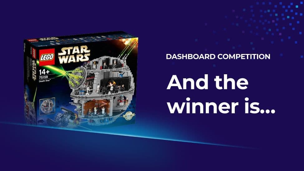
As part of the launch of our latest product Dashboard Server, we ran a dashboard competition over the last month, with the grand prize being a Star Wars LEGO Death Star set worth $800.

We are excited to announce that due to the exceedingly high quality of the entries we’ve received, we have decided on not one, but two winners!
Receiving one LEGO Death Star set each are Brian from Charlotte County, FL and Mike from CloudThing. Let’s take a look at both winners’ dashboards.
Winner 1: Brian from Charlotte County, FL
Network Services dashboard
This is the dashboard their Network Services team uses in their NOC, and it is displayed on four 65 inch 4K TVs in portrait. It’s huge! The main part of the dashboard is a Visio diagram in SquaredUp for SCOM. It’s a live diagram that functions as the team’s master documentation and dashboard.
The largest section of the diagram shows their backbone, core, distribution and access layer switches with SNMP status via SCOM. The smaller sections are mostly ICMP only status. The outer box (yellow rectangle) correlates to the overall environmental health of their data centers.
If you look on the top middle right of the dashboard, there is a tiny yellow outlined box with a yellow rain cloud – this means that the humidity in the dater center is a little on the high side. As they are located in South Florida, the weather can be a concern, hence the National Weather Service radar map embedded in the lower right. The upper right is embedded web content of a separate monitoring solution that shows some of the switches they aren’t monitoring with SCOM.
One reason we really like this dashboard is that it had a real world impact a couple of years ago, during Hurricane Irma. During that difficult time, this live diagram allowed Brian’s team to track which sites had lost power and determine which regions of their county were without power. This data then gave their local power company representative more precise and up to date information to relay to the relevant power restoration teams. Their Emergency Operations team was able to redirect first responders and evacuation plans with this information as well.
“We cram a lot of data on this screen, but at a glance, anyone in the NOC knows the overall state of our network.”
Winner 2: Mike from CloudThing
WorkLife dashboard
Like many of us, Mike has found that over the course of the last 12 months, his work and personal life boundaries have started to blur. As the Principal Architect of a cloud solutions company, he has been thriving at his day job as there’s been a huge amount of opportunity. Similarly, Mike has managed to adapt his family’s day to day life to the “New Normal” by leveraging on his technical background. Invariably though, this means spending even more time in front of the same screens and running the very real risk of blurring the lines between work and personal life.
Mike’s dashboard is both an acknowledgement of that fact and part of his attempt to keep a handle on his work/life balance. On the left is a collection of work items which are key – ensuring he’s not falling behind on communications, checking key client services are functioning and providing early warnings of changes to come. On the right, he’s added reminders so he doesn’t forget what he values in his personal life: important events, birthdays, family health/comfort and a little fun – in the form of an adorable reminder of why we work: our loved ones.
One of the things he loves about SquaredUp’s Dashboard – and what made his WorkLife dashboard possible – is the ability to mix technologies and integration methods. At work, CloudThing is an MS Gold Partner and all the key metrics Mike tracks are driven from the likes of M365 and Azure. In his personal life, his is a Google family, so he pulls from Google’s Calendar and metadata.
“In honesty, I’m constantly refining and updating my dashboard; sometimes to track new things in my day-to-day life and sometimes because I need to refocus my attentions at work as I move between initiatives. SquaredUp’s dashboard product makes that so easy that it’s finally possible to react with as much agility in my supporting tools as I do with my personal approach.”
Other awesome dashboards
We’d also like to give an honorable mention to the following people for submitting awesome dashboards. They each got to take home a LEGO X-Wing Fighter!
Peter from University of Birmingham submitted the Remote Desktop Services Performance Tear Off dashboard he created that was very well received when IT Services Staff found themselves working from home last year.
He also included a Christmas dashboard he made when his colleague got a little too relaxed at Christmas drinks. ;-)
Bert from BP IT Consulting submitted this dashboard he created for the purposes of giving developers an overview of the Octopus Deploy environment that combines all the information they need: windows service status, certificate status, API response times, the latest events, and the health of Octopus deploy on every machine.
Craig Dalrymple submitted a Veeam Backup and Replication v11 (REST API) dashboard that he made using our Web API scalar, grid and donut tiles.
Willem from Avanade submitted this dashboard that uses sample data from his own test Azure subscription – using a mix of the performance, status and cost tiles in SquaredUp for Azure. We’re especially loving the Star Wars twist!
A big thank you to everyone who’s sent in your awesome dashboards – we love to see what you manage to whip up with the software we work so hard on.
If you'd like to see more of what customers have done with our dashboards, check out our case studies here.
As always, happy dashboarding!