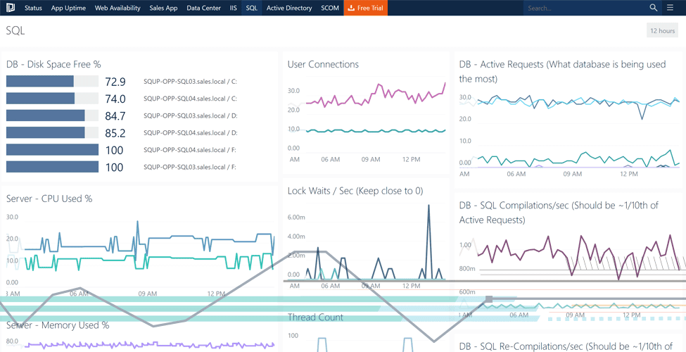
How to use our performance reporting features
This two minute walk-through video is designed to showcase some of the Performance Reporting features available in SquaredUp.
Connecting through to the SCOM Data Warehouse, SquaredUp gives you access to a goldmine of current and historic performance data. For most organisations who have SCOM, but are yet to try SquaredUp, this data sits untouched, gathering dust, buried behind a horrible reporting experience.
SquaredUp opens all of this data up to you and your users with fast, interactive HTML5 access and features a number of different Dashboard Tiles that you can use to display performance metrics, including; line graphs, sparklines, Top N bar graphs and Heatmaps.
Clicking on any these performance tiles brings you into an interactive performance reporting view, allowing you to see the metric in detail, change the timeframe, see Min, Max and Averages, compare it with other Objects or Groups within SCOM, and even export the graph and data straight to Microsoft Excel (great for sharing with users who may not have access to SCOM).
And because all pages have a unique URL, you can easily share with your colleagues via a whole variety of different means, allowing them to interactively explore the data themselves.
You can explore this feature interactively via our live online demo lab.
Additional Resource
If you’re not underway with SquaredUp yet, you can request a free 30 day trial.
If you’d like to see Performance Reporting live for yourself, simply head over to our online demo lab.
For more useful walk-through videos, check out our YouTube Channel


