Paul Godwin
Technical Account Manager, SquaredUp
These Azure dashboards built in SquaredUp use the Azure plugin to provide a quick view into the performance of your Azure resources.
Cloud platforms such as Azure provide flexibility and agility but gaining visibility into these vast and disparate environments is not as simple as many would like or need it to be.
Lack of visibility reduces the ability of resource owners to keep the environment up and running smoothly, potentially impacting the uptime of your critical environments. In addition, not having a good handle on the performance of cloud resources could also be negatively impacting the cost of Cloud investments with underutilised resources.
Cloud Administrators and Engineers need the ability to easily dashboard the metrics for the resources that matter to them, across the different tenants, subscriptions, or resource groups they have access to, and to do this without the need to jump between multiple interfaces.
These Azure dashboards built in SquaredUp show some of the capabilities of SquaredUp’s Azure plugin.
SquaredUp lets you easily create dashboards for your Azure resources, scoping a new tile with just a few clicks. The Azure plugin provides the ability to show metrics, alerts, and cost, as well leverage KQL queries against Application AppInsights and Log Analytics workspaces - all from one plugin. When scoping a tile, you can also choose whether to group, aggregate, sort or filter the data.
This capability means you can quickly put together a dashboard for your key resources. For example, with the Virtual Machines and Functions dashboards, we can easily show current or trending metrics to get a quick view on the performance of these resources. Such as errors and response times for our functions, or sort and filter to show the top VMs in terms of CPU and Memory usage. If we were looking at a larger set of VMs, for instance across Subscriptions or set of Resource Groups, this would be a great way to quickly highlight the VMs that we should pay attention to.
We can easily see the performance trend of the resources to see if any are being under or over-utilised, which helps in keeping the environment performant, and provides the opportunity to spot any resources that could be scaled down, in turn, reducing costs.
We have provided out-of-the-box dashboards covering common IaaS and PaaS resources used within Azure. Let’s take a walk through of a couple of these - the Virtual Machines and Functions dashboards.
These dashboards were designed to give you a quick view into the status of your VMs and Azure Functions, and a good starting point to start to develop your own dashboards around your Azure infrastructure and compute resources.
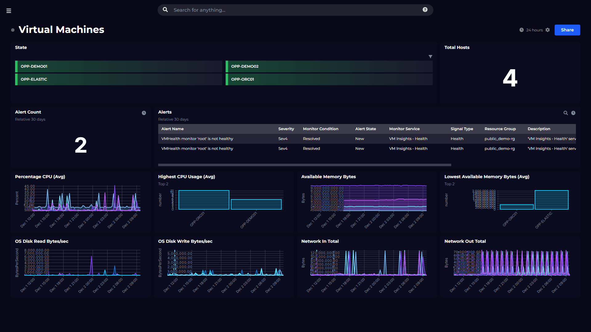
The top part of this dashboard shows you the current state of your Virtual Machines, as well as the total number of VMs depending on your scope. Below this we then have a view of any alerts, including total alerts and then a list with more detail on the alerts themselves.
Below this we then have some charts showing key metrics regarding our Virtual Machines. With CPU and Memory, we have line graphs showing a trend of usage. But we have also used the sorting and filtering capability of the tiles to show bar charts that just include the two virtual machines that are using the highest CPU and Memory, so we can focus our attention here to determine if a VM is being over or underutilised.
At the bottom of the dashboard, we have included some further metrics focused on disk and network usage. So, from this dashboard we can get an at-a-glance view of the performance of our virtual machines.
Similar to the VM dashboard, at the top we have a quick view of the state of our Azure Functions, as well as a total of these.
Below that we have a set of metrics which shows us the trend in terms of number of requests and also the average response time. Next to this we can see the current response time for each function.
The third row of tiles includes some other key metrics to understand the performance of our functions. These are App Connections, Average Memory Working Set, Bytes Sent/Received and the Execution Count for each function.
At the bottom we then have a nice view of whether any 4xx or 5xx errors have occurred. Again, we can see line graphs providing a trend of these alerts, and next to these a count of current alerts.
These dashboards provide a nice starting point for understanding some key compute resources within your Azure environments. But there is much more you could do.
You can also extend this capability with Monitors and roll-up status to report to other teams and executives. Share dashboards without the need to give access to Azure or train people on how to use it. You could scope the dashboard to look at the Virtual Machines for specific resource groups or subscriptions, and even show the cost of these Virtual Machines, all on one dashboard. Maybe you also have VM Insight metrics stored in Log Analytics that you want to query for and display on the dashboard. This is all possible in SquaredUp.
These Azure dashboards are available out of the box, so you can be up and running in minutes.
To see what other dashboards you can create, check out our Dashboard Gallery.
Monitor your Azure environment, including VM, Functions, Cost and more.
SquaredUp has 60+ pre-built plugins for instant access to data.

Plugs into anything Plug into any tool, on-prem or cloud, and surface real-time status. Connects silos Play nicely across teams – a central view with delegated control. Beautifully simple High-level summary status, perfect for a morning dashboard check.